Learn 10 Things to Make a Career in Responsive Design
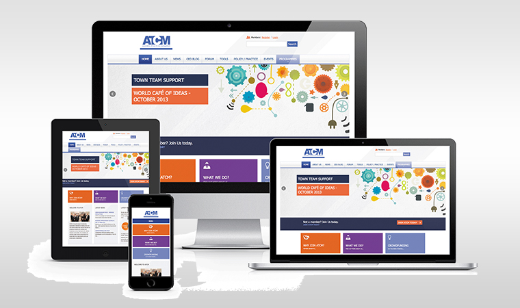
Seamless responsive design is building a user interface that is smooth and convenient. It helps create content that does not require lots of scrolling and zooming and is easy to read and navigate on most devices.Moreover, responsive designs are included as the top layout trends of the current year. Therefore, if you are also interested in the context and want a broader look, then this article shall guide you.
1. Single site for desktop and phone
Responsive design helps in creating a compact website that addresses to all issues of multiple site designing. In short, what works on the desktop works on the smartphone too.
2. Phone first, please
Create a site for the mobile phone, as not all web pages are easily accessible on phones. Responsive web designs are all about flexibility. This is what it means. Giving users the flexibility to use the app anywhere.
3. Welcome to instant information
When a user searches on your product, expose him to the benefits others have received while utilizing your product services.
4. Accentuate information with links
Place the link buttons strategically to generate some responsive action from those viewing your site.
5.Spacing and sizing
Structure content such that it explains what is needed and does not compromise on space too.
6. Image sizing and layering
An image with a lot of illustrations and typography might not be clear on the phone. Stick to presenting only a visible part of the image.
7. Homepage impression
The first look of a site is based on the homepage. You could take to designing a separate homepage for phones, but if you are able to present all the features on the site itself, it calls off the need to do so.
8. A smooth user experience
Using CSS visibility properties, you can display only relevant content by hiding extra information keeping the layout the same. Icons should be properly sized, without users being extra cautious with tapping the wrong ones.
9. Save bytes and bandwidth
Use smaller sized images and users disconnect mentally if the image takes too long to load. Hence,while designing the mobile site pay attention to the bytes.
10. Creative science
Combine simplicity and need and generate more conversions. You can achieve a seamless interface collaborating content and other elements on your site. This is easily achievable by A/B/n testing where many versions of a webpage are assessed for the highest conversion rate.


- PHP Development
- Java
- Js
- Android
- Design
- SEO
- Online Marketing
- Digital Marketing
- Content Marketing
- Google AdWords
- Facebook Advertising
- Remarkerting
- Social Media Marketing
- Affiliate Marketing
- Growth Hacking
- Conversion Optimization
- Marketing Automation
- Website Development
- Mobile App Development
- RealState
Need Assistance? Call us at +91 988 892 3050
Daksha Design is available 24/7 365 days a year. © 2018 All Rights Reserved
Post Comment
Fields marked with an asterisk (*) must be filled out before submitting.